Dear Mr. Hannah:
When I am asked why I draw the way I do my answer is, “Because I was bugged by happy housewives.” I say this half in jest, but in retracing my path as an artist I find that this answer best describes an important turning point that directed me toward what I now feel is the work I do best – nature illustration. But I’m way ahead of my story.
It began in a small town in central West Virginia, the town of Frenchton, where I was born in 1922 and, at a tender age, fell out of a second story window onto a tree stump. I emerged apparently whole from this experience, and it was not until several years later that my parents began to ask themselves if I had indeed escaped unscathed: I announced that I wanted to become an artist.
In the meantime we had moved to a farm where I spent many happy hours roaming over the Appalachian foothills. When there was hay to be stacked or corn to be weeded I did some of my best roaming, for I disliked farm chores intensely. I marvel now at my father’s patience with me, for he sorely needed all the help he could get in wresting a living for us (I have two older sisters) from a hundred West Virginia acres. He could not have known – nor did I know that I was building an affinity for nature that would one day find expression in my designs.
Upon graduation from Buckhannon-Upshur High School (where I learned that I could improve my grades considerably by illustrating all of my homework) I spent a year at W. Va. Wesleyan College before deciding that the most direct path to my goal led through a professional art school. I attended the Cincinnati Art Academy for a couple of years before being swept up in World War II.
Most of my Army service was in the Intelligence and Reconnaissance Platoon of the 414th Regiment, 104th Infantry Division. While I was constantly assailed by the senselessness and overwhelming horror of war, I was also fascinated by the scenes of devastation we encountered constantly in Germany, and I found time to make a large portfolio of on-the-spot sketches and paintings. I see now that this was a fruitful training period for me as an artist (though I don’t recommend it as a substitute for art school) because it taught me to grasp the important elements of a scene quickly and put them down with a minimum of detail.
A civilian once more, I enrolled at the Art Students League in New York and promptly became disillusioned with New York and New York living. It was no place for a country boy like me. Not that I was living in the best of circumstances – this was my period of suffering for my art. I rented a West Side walk-in clothes closet furnished with a bed, a dresser, and a 25 watt bulb. I failed to eat properly and developed a serious eye ailment due to a vitamin deficiency. But I was IN NEW YORK, and everybody agreed that’s where the action was, really the ONLY place where one could lead the artistic life. I kept telling myself I should love it, but after four months I fled back to the serenity of the hills. I spent a summer licking my wounds, then returned to the Cincinnati Art Academy to complete my training. I graduated in 1947 and was awarded the first Stephen H. Wilder Traveling Scholarship.
I had known Edie since my first day at the Art Academy, when we enrolled in the same classes, and over the years had come to respect her unique and versatile talent as an artist and to love her as a female of the species. We were married, and with her car and my scholarship, set out to paint and photograph the Great American West. We took four months, camping often to make the money last, absorbing the feel of the vast landscapes of the plains, the Rockies, the desert. I had begun to lose interest in realism after several years of preoccupation with it. I felt fettered by the laws of perspective and shading and decided that the constant attempt to create the illusion of three dimensions on the two-dimensional plane was limiting. It was only one’ of the tools at the artist’s disposal; I wanted to try others. I concentrated on trying to simplify the great natural forms and symbolize the design underlying the surface clutter. It was a giant step forward for me, but it made the next chapter of my life difficult, the chapter I call “My War with the Happy Housewife.”
I needed a job. A commerical art studio took a chance on my potential as a realistic illustrator, and soon regretted it. I was too realistic. I enjoyed painting real people with all the wrinkles and crow’s feet that gave character to their faces, but I was no good at the idealized, vacuous, happy housewives that greet you from every soap ad. Ever see one with bags under her eyes? A double chin? No. They never used any of mine. They tried me on cyst drawings for a medical booklet and I was real good at that. But there’s never any great demand for cyst drawings.
It was the most successful failure of my life because it made me realize that in order to succeed as an illustrator I must offer something besides realism, something unique and enjoyable yet salable. I began to search for something peculiarly me – a style, a technique, a point of view – and gradually it emerged: the impulse to caricature and simplify at the same time.
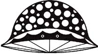
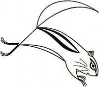
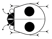
I fought the housewife battle by day and experimented with my new approach by night. Dropping the 3D and thinking flat, I looked at objects orthographically, which often led to fresh viewpoints and invariably revealed the particular projection that read fastest and made the best design. I reduced all lines and edges to straights and curves (that’s all there are) and began to render with mechanical drawing instrumentsruling pen, compass, French curve, T-square, triangle. I saw forms as hard-edge shapes of flat or textured color with enough lines added to complete identification. I began to include black and white in every full-color picture (forbidden in realism); spanning the value scale added sparkle and zip, and all colors seem to me richer in the presence of black and white. I didn’t discard depth, but achieved it by such devices as overlapping shapes and color and size relationships.
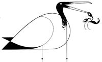
Nature subjects, I found, are ideally suited to this interpretation. Birds and fish in particular have built-in functional beauty imposed by their habitats and require only a little distortion of what’s there already, a thinning of lines and a simpler statement of shape. In perching and walking birds, and some insects, there exists a spatial tension because of the heavy body supported by slender legs that I find satisfying. The ratio of mass to size of its support is the secret the greater the odds, the more potential action is implied. In most mammals this ratio is unfortunately smaller. Elephants on stilts would be as elegant as egrets, but I never draw them that way because it would only start another round of bad elephant jokes.
 One of my fellow artists, Ray Podesta, suggested that my work was well suited to silk-screen printing, a process with which he was experienced, and he helped me with the reproduction of many of my designs. I was immediately attracted to the process and found its limitations a further stimulus to the simplification of my designs.
Silk-screen printing, also called serigraphy, is a stencil process in which the printing ink is forced through openings in a stencil that is adhered to a sheet of silk stretched tightly on a wooden frame. The printing paper, which is placed directly under the silk, receives the ink, then is stacked for drying and replaced by the next piece of paper to be printed. A separate impression is required for each color in the design, and the problem of registering the colors becomes more acute as more colors are added. Indeed, some of the most traumatic experiences of my life have resulted from the difficulties and frustrations encountered in silk-screen printing. But it is the ideal process for prints of my work. And I feel that, of all printing processes, it provides the most Intimate contact between artist and viewer. The rich surface of the print has all the quality of an original; in fact, I find my prints are usually more satisfying than the originals.
My work for Ford Times, the unique travel magazine published by Ford Motor Company, has given me the chance to experiment freely while working on a wide variety of subjects. My latent interest in nature illustration was encouraged by William Kennedy and Arthur Lougee, former Editor and Art Director respectively of Ford Publications. They conceived the idea of offering silk-screen prints of my designs to readers; thus the bird prints were born, a series of prints that eventually included 73 designs.
In creating a bird design, I read all I can find about the subject before touching pencil to paper. I would like to observe it in real life, but this is unfortunately often impossible. Besides, I am not a qualified field naturalist in the sense that most wildlife artists are, having arrived at my interest in nature illustration by a more roundabout route. So I rely heavily on my library of excellent guide books by photographers and realistic painters of wildlife for reference when I am searching for ideas. 
I want to know all about the bird’s way of life and how it fits into the ecology of its habitat. I want to know what makes the bird unique and what situation will best express this quality. If I build a story around it, I am careful to avoid anthropomorphism, having learned once when I illustrated “Bambi” that I am unalterably opposed to implying that animals act from the same motives and think the same thoughts as humans. Sometimes I show the bird from an unexpected point of view, as With the head-on view of the Cardinal. Always I try to express the personality of the bird by exaggerating yet simplifying its color and form. And I maintain a designer’s concern for the total area of the picture, trying to make it a satisfying arrangement of colors and shapes.
I start the design with thumbnail sketches, progress to full size roughs on tracing paper, and make the final design with a combination of cut-out paper for the larger shapes (the paper makes it easy to think flat, try different placements of shapes, and make changes) and designer’s color for the lines and smaller shapes.
I am now free lancing as a designer illustrator and teaching design and illustration at the Cincinnati Art Academy. I have done advertising art for many companies locally and nationally but find my greatest satisfaction in illustrating nature books and articles and creating prints of wildlife designs. I have illustrated the Golden Book of Biology and The Animal Kingdom, both for Golden Press in New York. I have illustrated nature subjects for Childcraft and World Book Encyclopedia.
I have designed two ceramic murals: one based on American wildlife, in the lobby of the Federal Building in Cincinnati, the other, called “Space Walk,” in the new Convention Center in Cincinnati. I decorated walls in the cafeteria and lounge of the Ford General Staff Office Building in Dearborn with Michigan wildlife subjects. My mural on transportation around the world was destroyed when the Ford Rotunda in Dearborn burned a few years ago.
My wife and our son Brett are my most respected critics. Her wide-ranging talent encompasses painting, photography, weaving, stitchery, ceramics, enameling, and jewelry-making, not to mention homemaking. Brett is, for his fourteen years, widely read in the field of nature and an ardent conservationist. We share an enthusiasm for canoeing and have spent many good hours running white water in the midwest and Canada. Since much of my work is intended for children’s books, I check all illustrations with him to make sure they will be understood. He helps me in making silk-screen prints and is a careful and conscientious craftsman.
At a tender age, Brett was knocked off his bike by a car and suffered severe injuries. It was a happy day for us when the bandages were removed and he emerged apparently whole. Recently, though, I began to ask myself if he did indeed escape unscathed: he announced that he wanted to become a farmer.
Sincerely,


